

Introduction
In the rush of UI design, it’s easy to focus on trends — colors, fonts, layouts. But there's one often-overlooked element that quietly determines whether users stay engaged or drop off: text readability.
At the heart of readability lies a powerful, simple principle — color contrast.
What Is Color Contrast?
Color contrast is the difference in brightness between your foreground (like text) and the background. The better the contrast, the easier it is to read, especially for users with visual limitations or people using devices in challenging lighting environments.
Why Contrast Matters in UI Design
Imagine these real-world examples:
- A user opens your site on their phone under bright sunlight — they struggle to read light grey text on white.
- An older person visits your app — but can’t make out pastel-colored buttons.
- A color-blind user is unable to spot important red-colored warnings or action points.
These aren’t minor issues — they’re barriers. Accessibility isn’t just a nice-to-have; it’s essential for real-world usage.
The Right Contrast Ratio (WCAG Standards)
To ensure accessibility, follow the WCAG 2.1 contrast ratio guidelines:
- Normal text: minimum 4.5:1
- Large text: minimum 3:1
- UI elements and icons: should also maintain visual distinction
Tool to use: WebAIM Contrast Checker
Real-World Example
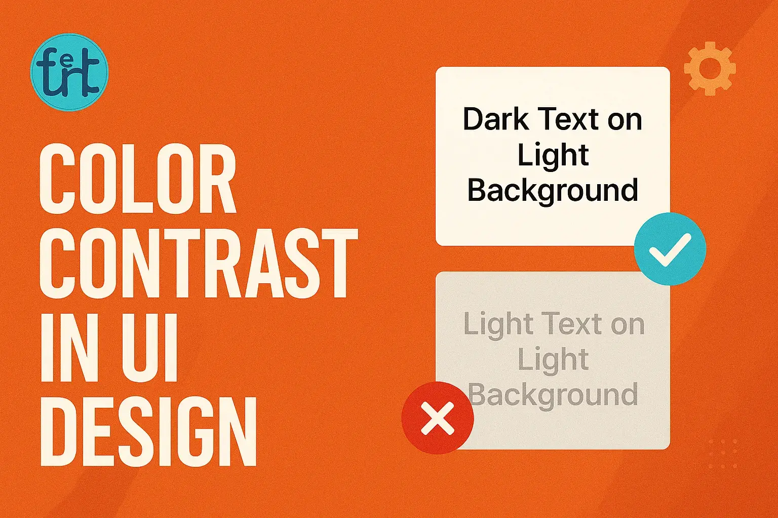
Poor Contrast (Hard to Read):
color: #bdbdbd;
background: #ffffff;
Improved Contrast (Easy to Read):
color: #1a1a1a;
background: #ffffff;
Even small adjustments can massively improve clarity.
Extra Tips for Beginner Designers
- Stick to a limited color palette and test combinations early.
- Use font weights like 500 or 600 for better emphasis.
- Don’t rely on color alone to show actions — use icons, underlines, or labels.
- Test your UI in dark and light modes to catch potential issues.
Benefits of High Contrast Design
- Increased readability → users stay longer
- Improved accessibility → includes users with impairments
- Stronger user trust → fewer frustrations
- Better SEO → search engines reward accessible sites
And the best part? It doesn’t take extra hours — just extra attention.
Final Note
Good design isn’t just about what looks beautiful — it’s about what works beautifully for everyone.
Contrast is not just an aesthetic detail. It’s a gateway to inclusiveness, and mastering it is a sign of thoughtful, responsible design.